
Interactive installation for the Innovation Night
The idea
In this project, it was important for us not only to showcase our skills but also to reflect the studio’s core principles in working with data. We planned to create a real-time dashboard because that is our strong suit, but in other aspects, we had complete creative freedom. At the initial stage, there were many interesting ideas, but we ultimately settled on one: «The whole world is data that can be visualized». This concept allowed us to break the perception of dashboards as just tables with numbers and show how fascinating data visualization can be.
When creating the visual style of the dashboard, we were inspired by the design of services that we see on phone screens every day — like these apps, the dashboard was supposed to collect and display data in real time.
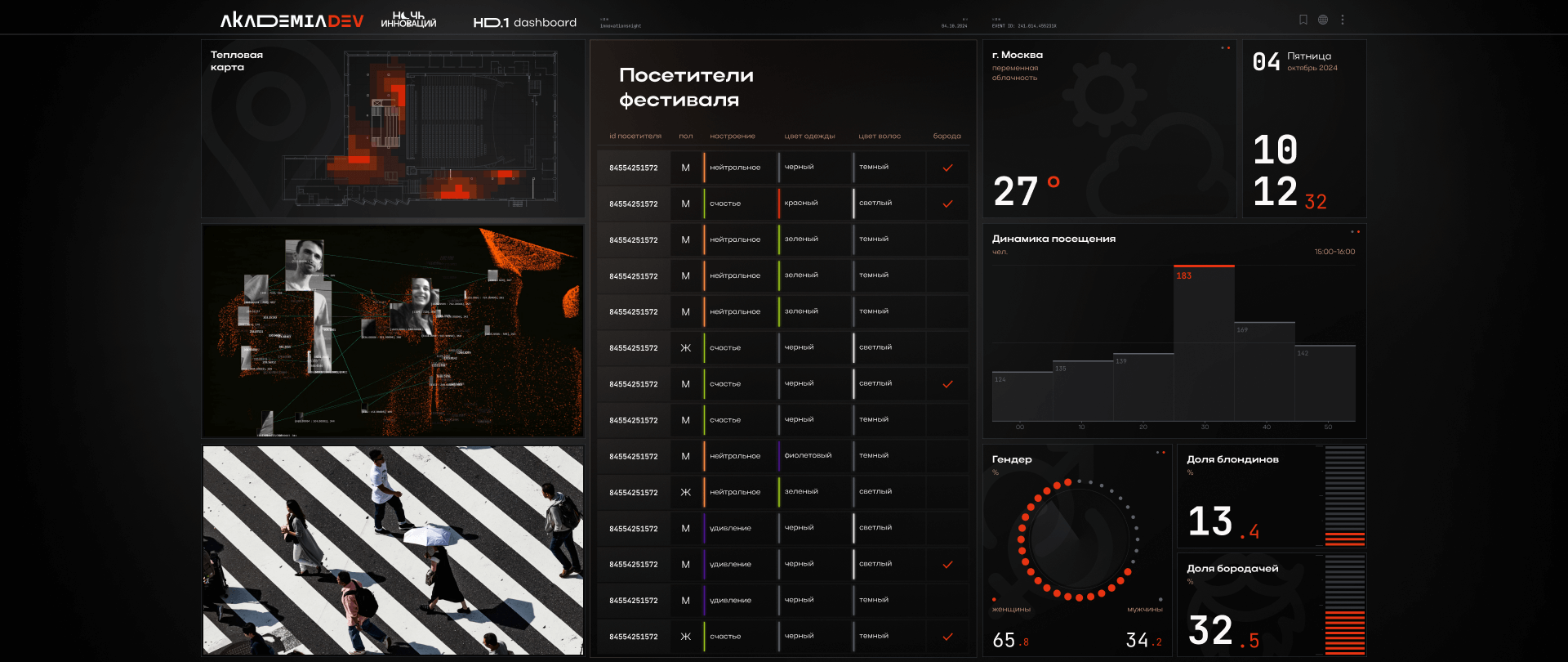
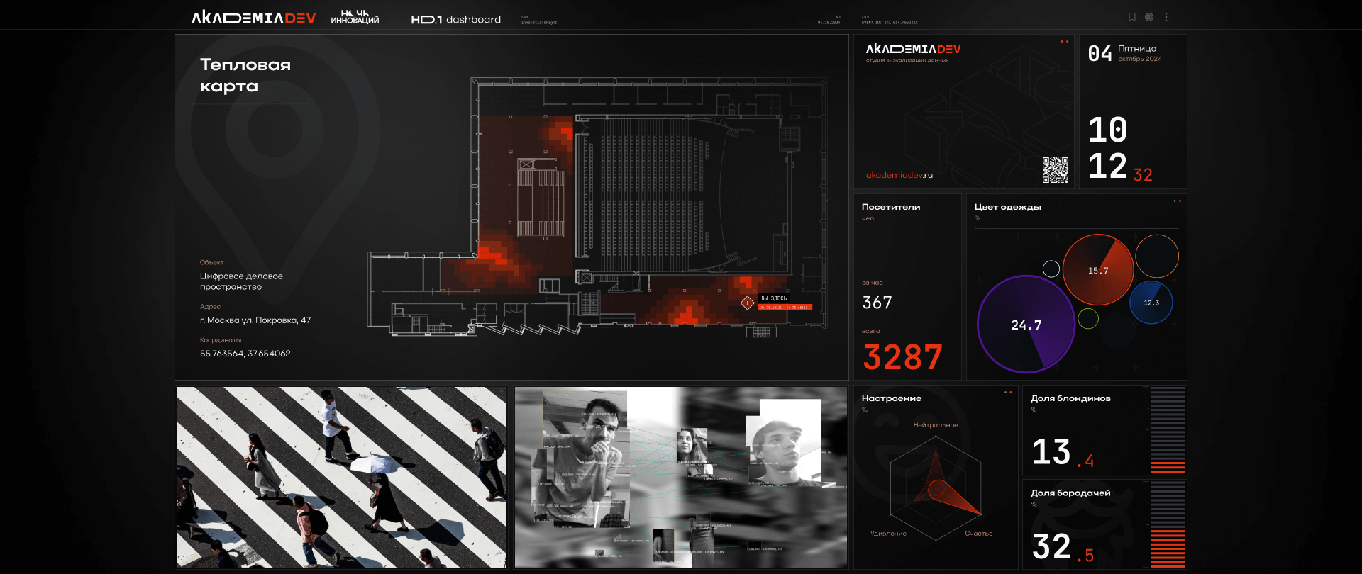
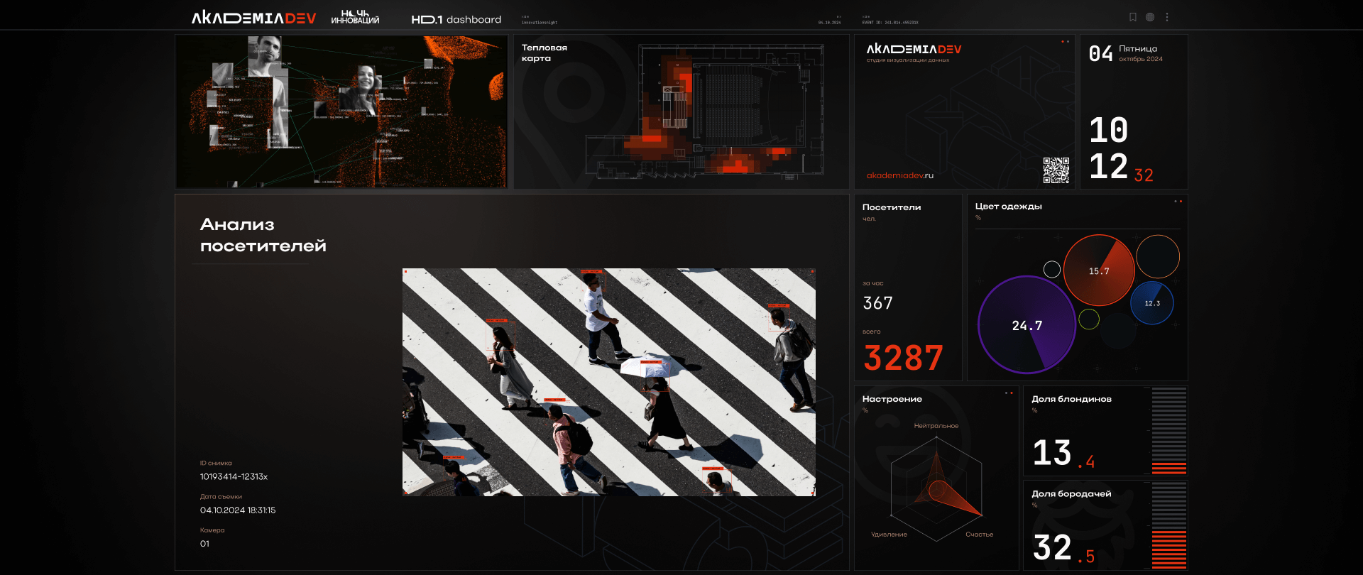
It was important for us to make the design as easy to perceive as possible, so we used fairly simple graphics and clear color accents. The dashboard included 12 widgets that changed their position on the screen when the page was switched.
Nikita Plyukhin
Head of the design department at AkademiaDev studio
Implementation
We installed cameras all around the festival hall, connected several AI models and analyzed data in real time, displaying the results on the screen. It was necessary to determine which data could be collected and processed as quickly as possible and to decide on the number of categories that would look impressive but not visually overload the dashboard. We selected the following: total number of visitors, their age, gender, color of clothing and hair, and presence of a beard. We used YOLOv8 — models were trained to identify the selected characteristics. For each category, several answer options were defined, and the final data was displayed as spectacular charts and in a tabular format.
To process the data, 40 AI models were launched simultaneously, wich worked in real time. These models were used to fill a single database, and then unique data was compiled based on similarities — that means the information collected multiple times about the same person was deleted. This allowed us to count the number of visitors. This stage was very important because it’s not as difficult to collect data as it is to extract information about each user, sort it, and display it in real time.
Zakhar Zotov
Touchdesigner/Ventuz developer at Akademia studio
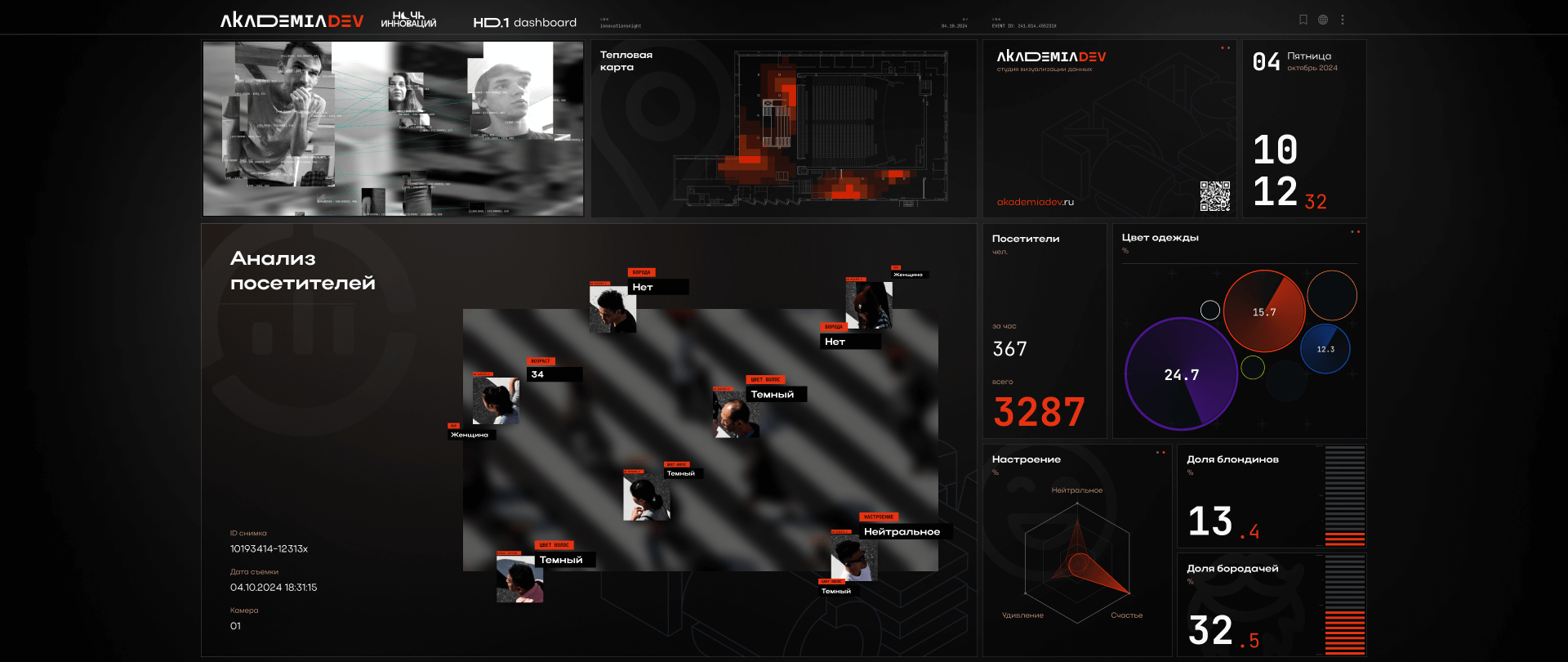
On a separate dashboard widget, photos taken at the festival were displayed, visually showing the results of the analysis: each face in the photo had 1-2 parameters from the data collected about them in the system. Additionally, the screen showed event attendance dynamics by hour, the ratio of men to women, dominant clothing colors, and mood in the form of charts.
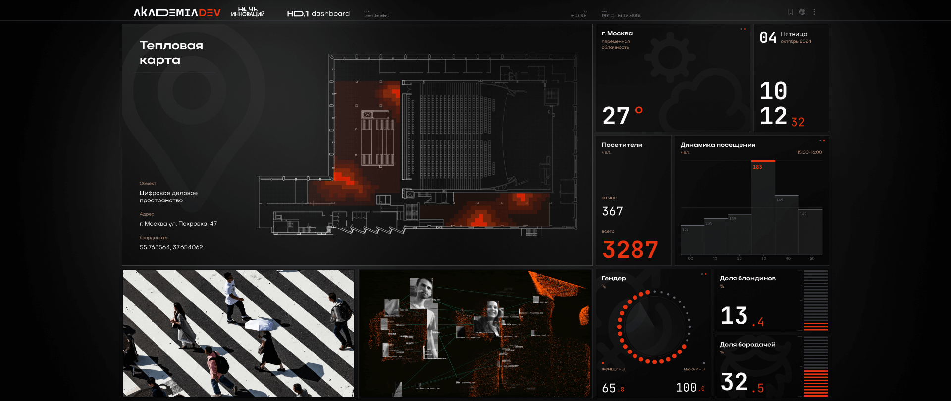
To create the heatmap we applied a new technology and invented a setup that allows us to analyze the number of people at specific pointsl. We used publicly available models on YOLOv8 that could detect head positions and, based on these coordinates, we calculated the density of people in the room. These indicators were displayed on the widget in red, highlighting the busiest zones — the more people at the location, the brighter the color.
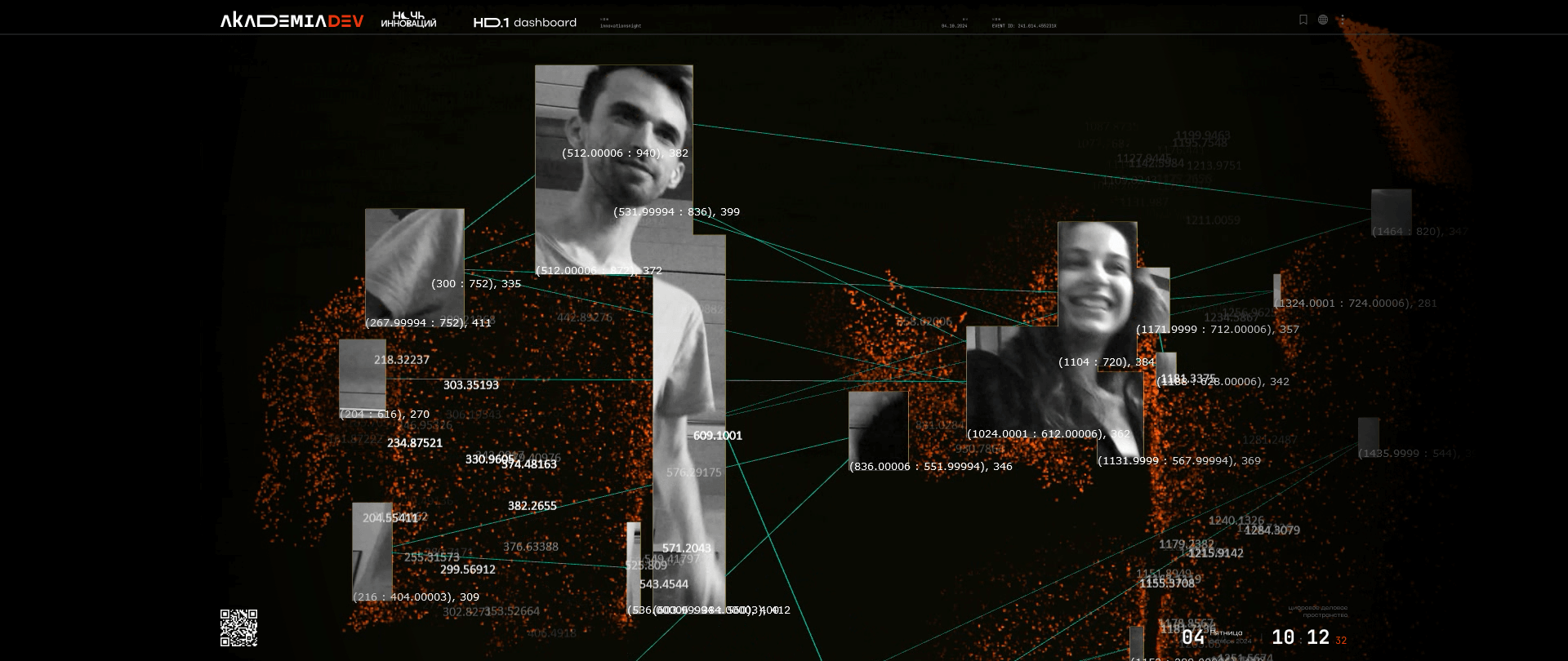
We had the idea to create a generative digital twin: when a person approached the screen a camera displayed their image, making a digital overlay and visually «breaking it down» into data. The visitor seemed to become a part of a data cloud, and their movements changed the image and affected the sound volume. We also used this technology for the first time, but after the festival we started implementing it in other projects.
Challenges
The screen was made up of nine equally sized monitors, and at the start, it was necessary to ensure that, no matter where the widget appeared on the dashboard, it would adapt to the specific size and not fall on the seam between the monitors. The rest of the setup was also technically challenging and required careful preparation: all information from the cameras had to be transmitted without interruptions.
The second challenge was processing large amount of data. Neural networks had to merge everything into a single database, and for visualization, the data had to be sorted and analyzed in real time. Due to the large number of variables, it was important to anticipate all possible errors. At the initial stage, our ambitions were enormous: for example, we selected seven mood categories for neuroanalysis. Once we got started, we realized that such a large number of variables would affect the accuracy of the analysis, so we reduced it to three.
Data from the cameras was sent to Touchdesigner, processed according to predefined requests, and uploaded to the database. I depluyed Postgres, and every 3-5 minutes Ventuz sent a command within the database for a particular visualization. At the time of the festival launch, the database was completely empty and was filled with data in real time. The biggest technical challenge was getting the data from the neural networks into the database in the right format: initially, it came in json format, which had to be parsed.
Sergey Tishchenko
Data analyst at AkademiaDev studio
At the final stages of the work, we encountered a problem typical of event projects: we had to change the location. Initially, the visualization was developed for a 4×4 layout, but we had to reassemble it for a 3×3 layout. Nevertheless, the team managed to quickly adapt to the new conditions. Thanks to the fact that the initial visualization consisted of modular windows, it was possible to reassemble the design for the new screen.
First and foremost, it was a very bold research project — we tried and explored many tools and formats for the first time. For example, we had never transferred data from Touchdesigner to a database before. Camera detection, digital twin, heatmap — we had not used any of these technologies before.
The work was very intense and had to be done in a short time. New ideas kept popping up, each more complex and interesting than the last, and we tested them all in the office. The result was a project that was colossal in terms of the effort that we put in.
Alexey Polishchuk
Ventuz developer at AkademiaDev studio
Opportunities
This project became special for us in terms of creative freedom and experimentation. We usually create custom solutions tailored to the specific requests of our clients, and in such projects risks are unacceptable. In this case, however, we had a unique opportunity to test our creative ideas and new technologies. At the festival, we tested and refined some solutions, which we now can confidently use in other projects.
Another feature of this project was an unusual pipeline for the AkademiaDev team. The dashboard was created in collaboration with Akademia studio that specialises in design for events. Therefore, in addition to classic development principles, a creative approach was used in the project: two art directors worked on it, Nikita Plyukhin from AkademiaDev and Anna Valueva from Akademia studio. There was a risk of two conflicting visions, but in the end, the unusual format helped to find interesting solutions.
The project became a major attraction at the festival: thanks to the idea of real-time data analysis, visitors were interested in interacting with the dashboard, and the digital twin feature encouraged them to take photos and share them on social media.