
Data visualization at the situation center of The Ministry of Transport
Client
We created a dashboard for the Ministry of Transport. A situation center — a room with screens and operators — is intended for monitoring and analyzing data concerning the transport sector. Our task was to collect and visualize key information on the dashboard, so that it would allow the employees of the center and important government officials to quickly assess the dynamics of the transport industry in the country and make strategically important decisions.
Early stages of work
Initially, the client did not have a clear understanding of the task, only a desire to visually structure the data. Before proceeding to development, it was necessary to define specific requests and problems that the dashboard should solve. Therefore, at the first stage we worked closely with the client, collaborating to immerse ourselves in the task: we conducted interviews and brainstorming sessions, and proposed possible phrasing options.
As a result, we identified a number of specific tasks:
Challenges
AkademiaDev has great expertise in working with screens of non-standard shapes and sizes. The studio creates custom dashboards for both classic monitors and ultra-high formats, including 16K. The project of the Ministry of Transport was no exception — the main screen of the situation center was non-standard and represented a grid of 12 displays of 3×4 size. At the design stage of the system, it was necessary to consider that important data would not fall into the seams of the screen.
The screen features also determine the colors of the dashboard. The block edges were black and would have been visible in a light theme, so we chose dark blue and purple as the main colors. This decision is also justified by the fact that the dark theme on the LED screen is easier to perceive indoors — it would be more comfortable for the employees of the center to interact with the dashboard throughout the day
Nikita Plyukhin
Head of design department at AkademiaDev

Working with data
In visualization we used consolidated data for all areas of responsibility of the Ministry of Transport and for all federal regions: passenger and cargo transportation, key transport enterprises, length of roads, domestic and international passenger flows.
The result
When creating a dashboard for a situation center it’s important to remember its main perspective — to minimize the steps in the process of making a decision. The official should immediately understand the dynamics of the presented indicators at a glance to make prompt conclusions. When working with client data, we always discuss the best way to reflect these dynamics. In which areas it is especially important to show it, how the indicators affect each other, and most importantly, who is responsible for a specific area. This approach allows for the creation of both beautiful and highly effective visualization.
We designed a multi-page dashboard that reflected key data on the Russian transport sector, dividing it into four sections: federal, regional, funding, and assignments. Inside the sections, the information was displayed on widgets that could be expanded for more detailed examination. In the dashboard, we used only two colors: different shades of blue to support the dark theme, and ochre, the signature color of The Ministry of Transport, to highlight important details. This allowed us to make the visualizations not only beautiful but also easy to read.
The initial idea was to create a dashboard as a separate virtual space with its own internal data system. The user could navigate within this space in search of the information they needed. In the end, we chose not to fully implement it because, in our projects, any aesthetic solution must be functional. But some elements of the concept were preserved: on the pages of the final dashboard, you can see how a three-dimensional abstract world builds up behind the data widgets.
Federal Section
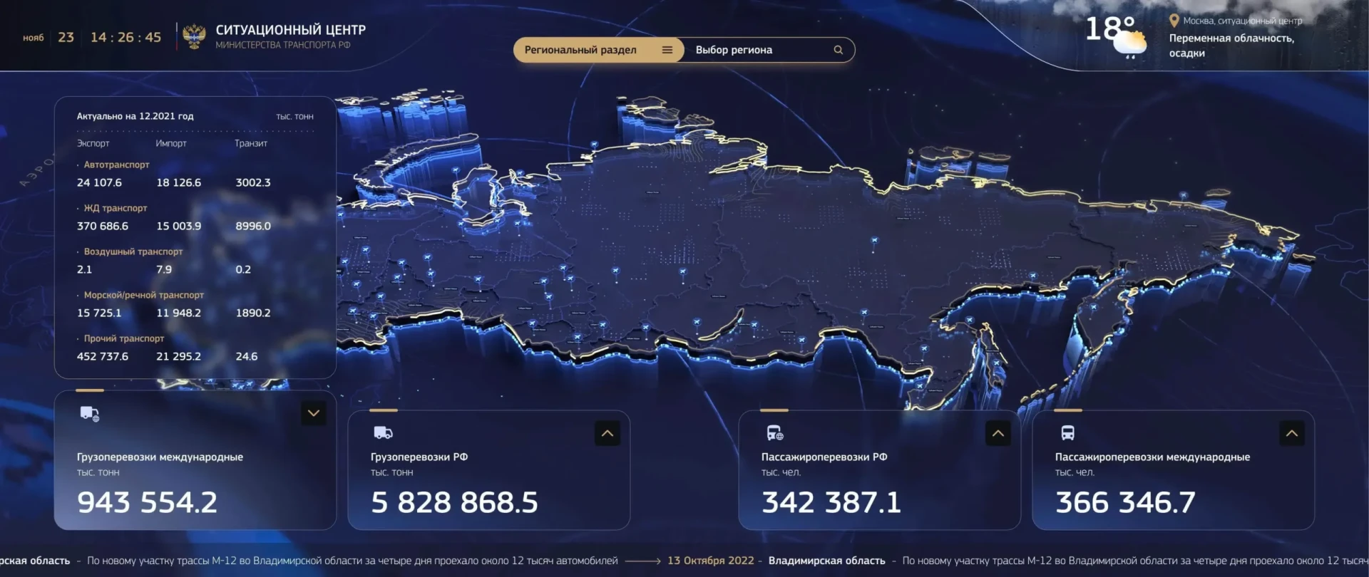
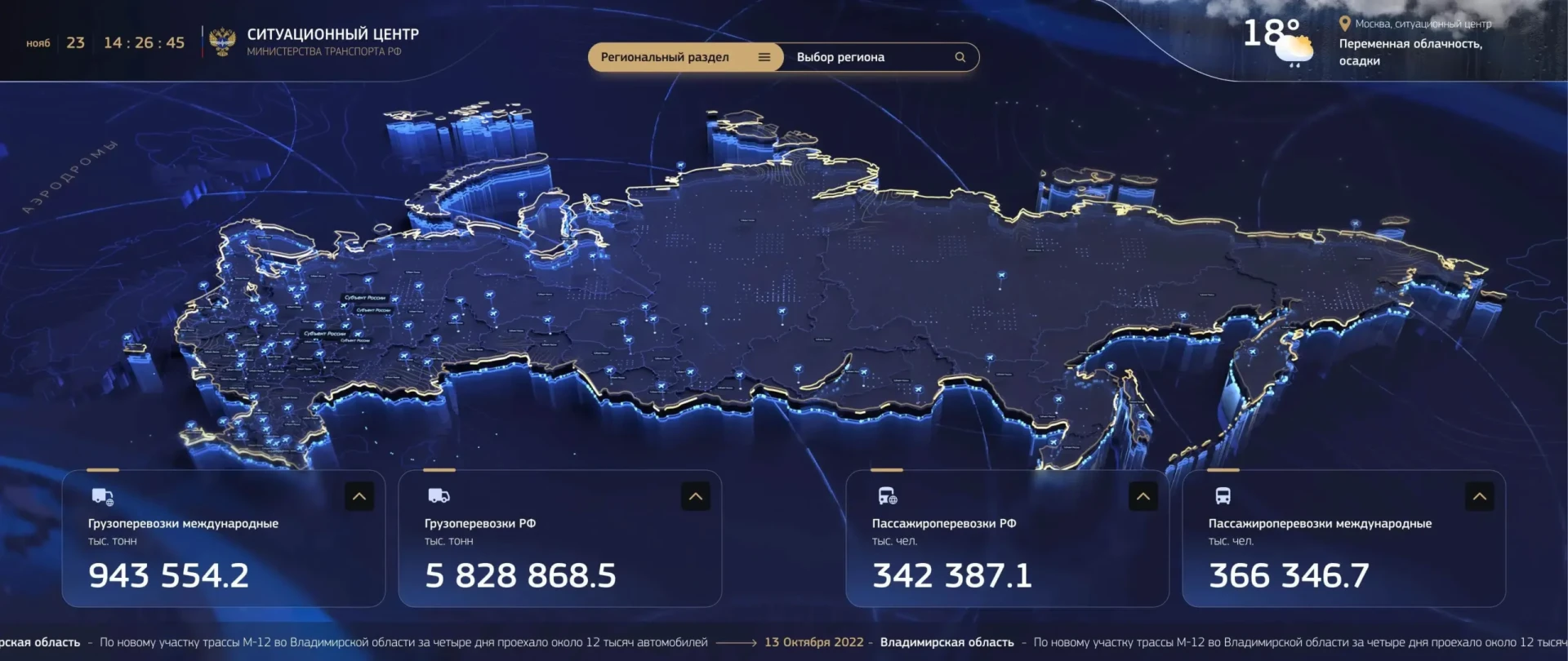
The main page featured an interactive map of the country, displaying general information about the transport sector of the Russian Federation: tracking of cargo transportation classified by types of transport, domestic and international passenger transportation, key enterprises and transport hubs, road lengths etc.
Considering the large screen size, we weren’t afraid that the dashboard space would be visually overloaded, so in addition to the main elements, we included a few more.» For example, at the bottom of the main screen, there was a ticker with key industry news, which was updated in real-time with latest information.
Nikita Plyukhin
Head of design department at AkademiaDev
To access the section with information about a specific region, it was enough to click on the area of that region on the map. For convenience, a search tab was added, through which one could also navigate to the section.
Division by regions
The regional section repeated the information from the main screen, structuring it by specific region. It was also possible to see all the main indicators for the sector displayed on the widgets. A separate widget showed the local officials — the regional governor and the transport minister. The section also included the names of checkpoints and airfields in the region.
Financing
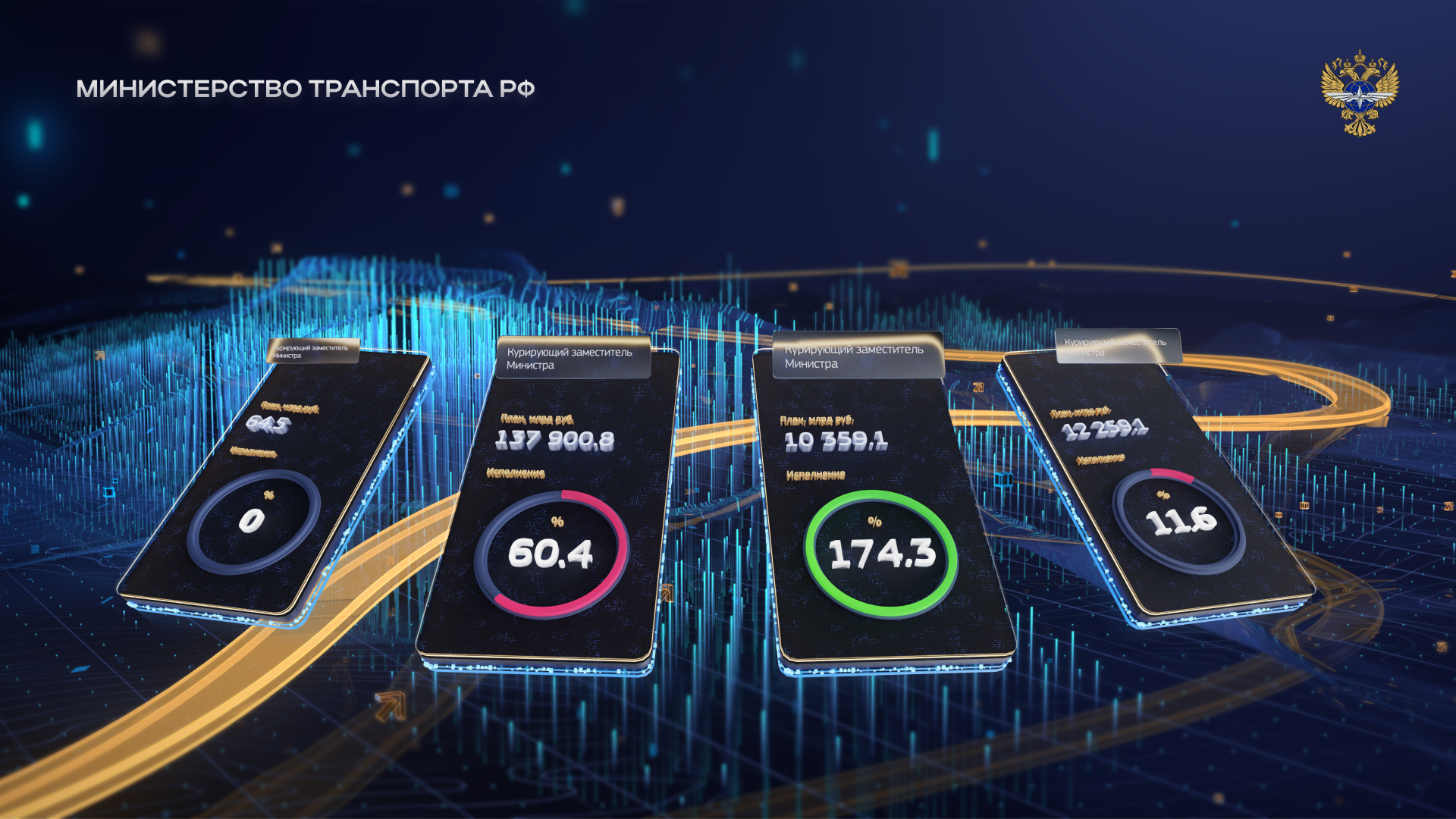
Together with the client, we decided to dedicate one of the main sections to data on regional funding. In the tab, one could obtain basic information on the execution of monthly funding plans: negative dynamics were highlighted in red, while positive dynamics were highlighted in green. All indicators were tied to specific individuals responsible for the expenditure direction. Thus, by looking at the dashboard, one could immediately draw conclusions about successes and failures, and identify those responsible for the results.
The information was displayed in two modes: the traditional table format and on volumetric widgets. Key data was visualized using charts reflecting the percentage of plan completion. The responsible person and the initially planned amount were also indicated. In table mode, additional indicators such as «actual amounts per week» and «deviation» were also introduced.
Tasks
The fourth section of the dashboard displayed current assignments within the ministry’s structure: both targeted ones from the president or the Prime Minister and non-targeted ones assigned by the minister himself. Having reflected this information in table format, we realized that we also wanted to provide a more visually engaging option. Thus, the idea of «planets» emerged, each symbolizing an official. Every planet was surrounded by two rings, one of which represented a chain of targeted tasks, and the other non-targeted ones. We depicted the tasks themselves as small rectangles of different colors, which were strung onto the rings of the planets. As the planets were scrolled, they rotated, and the rings approached the viewer. This small dynamic detail added an effect to the visualization. The planets were complemented by widgets indicating the total amount of tasks.
Problems
At one stage, we encountered the problem of lack of resources that we needed from the client. An ambitious idea was proposed to include real-time incident tracking in the dashboard: the system would monitor media and social networks by hashtags, gather data on incidents that occurred, and display it on the main screen with a slight delay. Visually, it would look like a red beacon in the corner of the screen. This would allow us to almost instantly learn about transportation news across the country and promptly respond to any events. Unfortunately, we were unable to implement this idea because we never found a tool that would allow us to monitor and quickly collect enough data to display on the dashboard.